Pages

Saturday, March 22, 2014

The Friends of Government Center

In honor of the shutdown of Government Center, I present you a side-by-side comparison of scenes from "The Friends of Eddie Coyle" (1973) and the same scenes, as close as I could get, in 2014.


Although it's neat to see the similarities after 40 years, it's in the sense that: "I cannot believe they left it like this for so long." I won't miss the old brick pimple, the tiny escalators, the cramped fare gate area, or the dirty walls. Government Center is a relic of an era when architects openly longed for the aesthetic of the Soviet Union. A time when it was desired to have design that intentionally repelled life, in order to crush people's spirits, and send them fleeing from the city. Good riddance to all that. Now: what to do about the oversized, desolate plaza and the concrete monstrosity next door...


(film scenes source: DVD of "The Friends of Eddie Coyle", Paramount Pictures)

Tuesday, March 18, 2014

A first look at the "37 billion mile" data challenge, with some maps

MAPC has put together a data set from MassDOT that consists of the entire Commonwealth's vehicle registration data (suitably anonymized), including odometer readings, and then summed it up in quarter-kilometer square blocks. I grabbed a copy of the data and plotted a few simple Google Fusion maps to check it out:


Household Vehicle Miles per Day

You can see that the data is presented in blocks that are 250 meters on a side. MAPC prepared an estimate of how many miles per day each household travels in one of their cars. That can range from zero, for households with no cars, all the way up to this one crazy person who apparently drives 646 miles per day. I have chosen a color scheme such that the miles driven is divided up into quintiles based on city of Boston map squares. A fifth of the Boston map squares fall into the category of "0 to 11.98 mi/day", the next fifth are "11.98 to 17.65", etc. Although the map shows regional data (and state-wide data is available in the complete set), I decided to focus the color scheme on Boston because I am most interested in the car-free and car-light households.


Vehicles per Household

The same largely goes for Vehicles per Household, which is obtained by taking the number of households in each map square and dividing it from the number of vehicles registered to an address in each map square. Note that "households" is defined as the number of households counted by Census 2010, and registered vehicles were geocoded into the various map squares but that process was not always successful. There have been some slight adjustments to the numbers, according to MAPC documentation, to account for the vehicles that could not be accurately pin-pointed. I will trust their models for now.


Car-free Household Percentage

The last one just highlights where the households with the least number of cars are found on the map. I don't think there are too many surprises here, especially for people familiar with my map based on Census/ACS data. The effect of the Green Line is pretty pronounced, it's easy to see the trace of Commonwealth Ave, Beacon Street, and Huntington/S. Huntington Aves. In fact, the abrupt end to blue-colored blocks just past Heath Street seem to indicate that the loss of the Arborway trolley has really taken a toll in terms of increased car ownership around Centre Street. Or maybe it was increased car ownership that led to the cutback. Another interesting pattern is around the new Fairmount/Indigo Line stations. Most of them seem to be near pockets of car-light or car-free households, even though the stations are relatively new. No doubt, that was a key motivation in the planning of the line.

Quick note on outliers: sometimes you may spot a square that is radically different from its surrounding squares. It could easily be a matter of small sample size, or just a local facility that is skewing the data. For example, a nursing home. Or the Four Seasons hotel, which seems to have about 170 vehicles registered between it and the Boston Public Garden. Sanity checks are always a good idea.

Friday, March 7, 2014

The need for station consolidation on the MBTA "B" branch, in one chart


Update: MBTA announces station consolidation public meeting, Oct 23rd.

Original Article:
A little while back, BU put together a Transportation Master Plan that included some detailed ridership data about the MBTA Green Line "B" branch. I somehow missed this appendix while looking through their master plan in the past. Thanks go to Eric Fischer for alerting me to my oversight.

The data include hour-by-hour breakdown of boardings, alightings, and line volume (the number of people riding through) for each of the surface stations Blandford Street through Warren Street, taken on a Fall 2010 day. It occurred to me that a station's importance is related to the number of people who use it, versus the number of people who would prefer to ride past it. This is also tied to the relative proximity of the stations. Multiple, closely spaced stations will divide up potential ridership and therefore, will mutually reduce the importance of each such station.

The four stations in the scope of the upcoming Commonwealth Avenue Phase 2A street rebuilding project are very closely spaced. They are some of the most closely spaced stations in the entire system, as they are placed on four consecutive city blocks approximately 730 feet apart on average. That is a 2-3 minute leisurely walk between stations. Perhaps only Back of the Hill and Heath Street are closer.

The diagram above is drawn to scale, and it shows how the stations are spaced relative to one another. Above the station names is a bar graph which shows the relative importance of each station, as measured by the number of people who use the station (boarding, alighting) divided by the number of people who ride through the station. It should come as no surprise to any frequent user of the "B" branch that Harvard Avenue is the most important station, by far, and that the four least important stations are: Babcock Street, Pleasant Street, St Paul Street, and BU West; the last being the most underutilized.

I believe that this diagram makes a strong, visual case for station consolidation during the upcoming Phase 2A project, in addition to station relocation to better accommodate signal priority. I would like to see the MBTA begin a public process, much like they did ten years ago, to work on implementing efficient station spacing for this section of the Green Line.

In addition to improving the experience for about 30,000 people, a shorter round trip time will save resources for the MBTA. If the scheduled round trip time for a train can be reduced by 6 minutes, then that means one fewer train is needed to operate the same peak schedule. That train can then be put to better use in other ways: to split it into more 3-car trains, to help bring back 5 minute frequency, or to send it out for much needed maintenance.

Even more savings are available if the MBTA finally implements all-door boarding and transit signal priority, but that's another discussion.

A quick note on the gap between BU West and BU Central: that space is mostly occupied by the Mass Pike trench, currently. The overpass of the Pike will be reconfigured as part of Phase 2B, and then I believe that BU has some air rights projects in mind. If station consolidation is properly implemented in Phase 2A, and if BU ever builds over the Pike, then it may make sense in the future to relocate BU Central further west. But until then, the most pressing issue is figuring out how to fix the Green Line problems within the scope of Phase 2A.

Tuesday, March 4, 2014

Yawkey Station and Fenway Park events

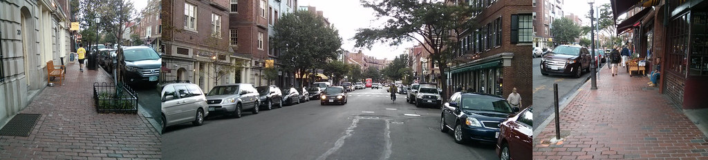
The new Yawkey Station is set to officially open -- finally -- on March 10th. It's a pretty big improvement over the old asphalt strip. And it will get service commensurate with its design: every train will stop there, which is one more than Back Bay gets. But I feel like there is a missed opportunity here. Everyone who rides the Green Line knows that on game days, when nearly 40,000 fans descend upon Fenway Park, the T is completely stuffed. Baseball games typically start just after 7pm which coincides with the pm peak. If you make the mistake of trying to use the Green Line in the Central Subway between the hours of 5pm and 7pm on a game night, you may not be able to board. I am, of course, very pleased that so many citizens and visitors choose to use public transportation or walk to get to the baseball game. I would say that the majority of the attendees do so, and that is to the great credit of Red Sox nation and the city of Boston; unlike the lunar-like surroundings of many other cities' stadiums, Fenway Park is in a walkable place.


Not Fenway Park!


To continue to encourage this trend, the MBTA ought to be looking at opportunities to increase capacity: especially as the remaining surface parking lots get developed, finally. Fixing problems on the Green Line is welcome, certainly, but won't come cheap or easy. It needs a power system overhaul and new vehicles, just to keep up with burgeoning ridership. But those are multi-hundred-million dollar items. Now, they are putting the finishing touches on a commuter rail station adjacent to Fenway Park, intended to help serve Fenway Park and its vicinity, but will they run the service that is needed to make the investment work?

A typical weeknight baseball game begins at about 7:10pm and lasts about 3 hours. Except, this is the Red Sox, so you have to figure it might go to four hours. Weekend games are known to generally start at 1pm, 4pm, 7pm, 8pm, or even 11am for the Patriots' Day game. The scheduled service is pretty miserably bad on the weekends (every 2-3 hours), so I will not focus on that too much.

Traveling from the west


The new schedule shows the following trips:
  • Train 528 departs Worcester at 4:40pm and arrives at Yawkey at 5:59pm
  • Train 530 departs Framingham at 5:15pm and arrives at Yawkey at 6:53pm
Those are usable for just about everyone with access to the Worcester/Framingham line, and they make every stop except for the three innermost Newton stops. Going home,
  • Train 543 departs Yawkey Station at 10:36pm
  • Train 545 departs Yawkey Station at 11:36pm and is the last train of the night
So, except for the very longest games, this could work. I did stay at one game, a few years back, until past 2am -- it happens -- but pretty much everyone who was time-constrained had left long before. From 7:10pm to 11:36pm is a 4:26 window but you have to factor about 20-30 minutes for people to escape from the Park itself at the end of games.

However, this kind of trip isn't very useful for decongesting the Central Subway. It's not a clear win over driving to Riverside ("D" branch) either, but that route gets pretty busy as well and there may be people looking for alternatives.

Traveling from the south side

This is where the new schedule had much more potential to take a load off of the Green Line and I think that it failed. The Green Line and the Worcester line are not exactly parallel, but they are close, and the Worcester line connects with the Orange Line, the Red Line, and numerous commuter rail lines. This could have offered an alternative travel path for many attendees, freeing up a bit of capacity on the Green Line.

Connecting between trains is a bit more of an ask, especially for people who are not typical riders, but it could be publicized and accommodated if the organizations would be willing to try. And certainly, there is a compelling offer: go this way and don't be a sardine on the overcrowded Green Line; it's cheaper and less aggravating than driving and parking.

However, the train times don't really work out:
  • Train 535 departs South Station at 6:40pm and arrives at Yawkey Station 11 minutes later.
  • Going back, train 540 leaves Yawkey Station at 10:47pm arriving at South Station in 10 minutes.
  • And, train 542 leaves Yawkey Station at 12:27am.
Getting to Fenway is okay, although train 535 is technically part of the peak and may be crowded already, but returning is absolutely fraught with peril. Both of those are "L" stops as well, so the train may leave early. Here's another problem:
  • The Franklin line has departures at 10:35pm and 11:50pm, totally missing the connection.
  • The last Fairmount train leaves at 9:40pm.
  • The last Stoughton train is at 11pm and the last Providence train departs at 11:59pm.
  • The last Needham train leaves at 10:30pm.
  • The Greenbush line only has a departure at 10pm, but who rides that anyway?
  • The last Middleboro train leaves at 10:30pm and the last Kingston train leaves at 10:40pm.
Basically, the 10:47pm train from Yawkey to South Station does not mesh well with any of the other line schedules, and even the most closely timed line -- Stoughton -- will be missed if there is a delay of a minute or two. And 10:47pm may be too early a departure for a Red Sox game.

So this isn't looking too great. On the other hand, the connection could still help Red Line riders, which is quite a large population. And with some changes, there is utility for Providence and Franklin line users as well.

A game shuttle

Providence train 822 arrives at South Station at 6:22pm which brings it in time to make a connection to the 6:40pm departure towards Yawkey. However, Franklin train 796 doesn't get there until 6:50pm, which is too late to connect.

However, at this point, the peak time is over and it may be possible to do something a bit unorthodox for the MBTA: turn train 796 quickly and send it out towards Yawkey, at about 7pm. It can skip Back Bay station and get there before the game starts. The empty train can then proceed to Beacon Park to turn back toward South Station. This gives you two things:
  • A one-seat ride for Franklin line riders
  • A second, game-night option for all others
I would even recommend simply not checking tickets on the Yawkey leg of the trip, in order to speed up boarding and make things run as smoothly as possible.

On the way out, a similar, special trip could be planned. A large consist could be staged and prepared to pick up passengers starting about 15-20 minutes after the last out of the 9th inning (within reason). You would not want to use DMUs for this purpose because this is exactly the sort of trip that the large capacity locomotive/passenger configuration is best for. That train would move to South Station, unload passengers, and then become a Providence or Franklin train, possibly even a special, additional trip.

Conclusion

So, would this all work? Well, I think it would be attractive to Red Line users who are probably sick of the crush at Park Street pre- and post-game. The commuter rail is a bit more of a stretch but with some ingenuity, and publicity, it might be possible to get some significant ridership: especially if there were guaranteed connections timed around the baseball game. When I was spending some months in the San Francisco Bay Area, I often rode back on the special "game trains" that were added to the schedule after Giants games. AT&T Park is only two blocks from the 4th and King terminal. Caltrain, as any rider knows, is far from the cleverest agency in the world. But those trains were generally packed with baseball fans. Now, it's easier when you only have one line to coordinate. But this is something the T ought to be able to handle. It might even be good practice for the future, when frequent DMU shuttles will make the idea of connecting between commuter rail lines somewhat less quixotic. To me, it just seems really strange to invest so much into this transportation infrastructure, and then not put it to use when the capacity is really needed.

Sunday, March 2, 2014

The perversity of the Beacon Hill historic district

Beacon Hill (the neighborhood, not the state house) is in the news this past week for the Beacon Hill Architectural Commission's (BHAC) refusal to comply with the Americans with Disabilities Act. Apparently, accessible pavers and handicap ramps, they claim, would mar the historic character of the neighborhood. Adam has some fine snark in response:
Yes, they would seriously detract from the hundreds of colonial automobiles parked on colonial asphalt underneath all those colonial Resident Parking signs when their drivers (garbed in breeches, no doubt) aren't busy stopping for colonial traffic signals and colonial stop signs.
Here's what Mark Kiefer, a member of the BHAC, and apparently the most oblivious person in the city, had to say about tactile strips which help the visually impaired:
“It’s a matter of the visual impact,” he said. “We don’t want prominent things people will see commonly to smack of modernity.”
I happened to stop by Beacon Hill this weekend and it reminded me just how hypocritical, stuck-up, and snobby these BHAC cretins are. Here's Bowdoin Street, near the edge of the historic district, where a historic six-lane highway leaves hardly any room to pass by on the sidewalk. Apparently, this scene does not "smack" Mark Kiefer "of modernity" at all?

Historic SUV parked on historic asphalt next to charming lamppost blocking historically small sidewalk.
Approximately 75% of the street width is devoted to automobiles and fast-moving vehicular traffic. 
Bowdoin Street is 60 feet wide from curb-to-curb, easily enough for 4 travel lanes and 2 parking lanes. Or maybe it should be 4 horse lanes and 2 horse post lines. Because history. Anyway, BHAC is curiously silent about the heavy presence of parked cars and speeding vehicles on this street, while people walking try to squeeze by scattered obstacles and bottlenecks.

My impression of Bowdoin Street is that it is a half-victim of urban renewal, actually. It was originally constructed as a 40-foot street in 1727. I haven't found records of the widening, but, the far side of the street all looks like relatively newer construction with a historic-looking facade. If I had to take a guess, I'd say this is probably a victim of the Boston City Planning Board's insane zeal for street widening at any cost. Or, maybe Ed Logue and the BRA, since it is Government Center-adjacent. Whichever way it came about, here's how I'd describe it: not historic.

My post last year about the horrifically wide streets around the Public Garden also touches upon some Beacon Hill streets, notably Charles Street and Beacon Street:

Massive motorway -- tiny, oft-obstructed sidewalks. Ridiculous.

Nothing more historic than a four-lane highway. Right?
Beacon Hill does have some truly charming and wonderful streets. And even a historic feel, if you can overlook the omnipresent automobiles. But it's completely insane for the snobs at BHAC to be complaining about handicap ramps, unless they are prepared to stand up against all the BMW and Lexus owners who litter the historic streets. And while we're at it: modern plumbing and electricity too. Beacon Hill wants to pretend to be some kind of half-museum: pro-preservation, but only when it's convenient.

I understand the desire for historic preservation. I am, after all, a huge fan of narrow, medieval-style streets, such as those still found in some parts of Beacon Hill. I realize that historic preservation movements managed to save some parts of neighborhoods from the horrors of urban renewal and modernism. But there's a point where the movement becomes self-parody. This is one of those points: when cars are treated with more respect than people, the neighborhood has lost its way.

Remember the reason why historic preservation resonates with people: it's because the architecture of the latter 20th century is so terribly inhuman. Therefore, we cling to anything from the past, to buildings built during a time when designers still remembered how to relate to the human beings walking on the street. In a way, we're still stuck in the architectural Dark Ages, trying to feel our way out, trying to relearn was what forgotten during the modernist era. But one new idea that we do have right, in law if not in fact, is the notion that the city should be accessible to all its citizens.

Beacon Hill, get your streets in order. Put people first.