Pages

Showing posts with label map. Show all posts

Sunday, July 27, 2014

Boston the walking city

Spotted this data visualization by the creators of the "Human app" for the iPhone. I don't have an iPhone so I'll let them explain it:
Human is an iPhone app that runs in the background of your phone and automatically detects activities like walking, cycling, running, and motorized transport. All visualizations are solely based on aggregated data from people using the Human app. Imagery shown does not involve the use of maps, as white pixels were drawn by moving Humans.


Walking in Boston as measured by the app (source)
In addition, it finds that 46% of activity in Boston was walking, compared to 43% motorized, 4% running, and 6% bicycling. I also noticed that the visualization of motorized activity includes the surface portions of all the MBTA rail lines: if you look closely you can see them all traced out pretty clearly where they diverge from other roadways. No tunnels are included in the charts at all, presumably because GPS doesn't work underground. So, it seems that in this case, "motorized activity" also includes riding the T. Boston's high walking rate puts it in the top ten worldwide, and only behind Washington, D.C. and New York City in the United States.

I think that's a nice confirmation of what we already knew from census and survey data. If anything, it may show that those estimates were too low, especially since they often focus only on journey to work, which is usually considered to comprise about 20% of total trips. I think that the main criticism of this work, and the one thing that holds it back from being scientifically useful, is that it is only measuring people with iPhones AND the Human app. And I have no idea how well iPhones are distributed among the population, but I can guess: they probably skew towards the rich and technologically literate. So there are some fairly egregious gaps in data. For example, much of southern Boston is simply ... missing. I couldn't tell you whether that's because walking is rare there, or because iPhones are less common. Based on personal experience, I don't think walking is rare in neighborhoods like Roxbury and Dorchester, so I think it's more likely that there are just fewer people carrying iPhones with the Human app installed.

Friday, April 4, 2014

More fun with maps: walksheds and transit lines

As a follow-up to my first look at the contest data, I have mapped the "transit walkshed" coordinates from the 37 Billion Mile contest. This one took a bit more doing since the shapes were linked only to the names of stations, and those names were formatted differently from the way the MBTA official data publishes them. So some "fuzzy" string matching was in order, plus hand tweaks.


The result is worth it, I think. It shows the rapid transit lines, the Silver Line, and some of the key bus route stop walksheds (others seem to be missing). They overlap quite a bit so the colors combine into intermediate shades. The walksheds seem to be streets within a 10 minute walk of the station stop, or so. It's interesting to compare the shapes in different locations, especially seeing the effects of different block sizes and connectivity levels on accessibility.


Tuesday, March 18, 2014

A first look at the "37 billion mile" data challenge, with some maps

MAPC has put together a data set from MassDOT that consists of the entire Commonwealth's vehicle registration data (suitably anonymized), including odometer readings, and then summed it up in quarter-kilometer square blocks. I grabbed a copy of the data and plotted a few simple Google Fusion maps to check it out:


Household Vehicle Miles per Day

You can see that the data is presented in blocks that are 250 meters on a side. MAPC prepared an estimate of how many miles per day each household travels in one of their cars. That can range from zero, for households with no cars, all the way up to this one crazy person who apparently drives 646 miles per day. I have chosen a color scheme such that the miles driven is divided up into quintiles based on city of Boston map squares. A fifth of the Boston map squares fall into the category of "0 to 11.98 mi/day", the next fifth are "11.98 to 17.65", etc. Although the map shows regional data (and state-wide data is available in the complete set), I decided to focus the color scheme on Boston because I am most interested in the car-free and car-light households.


Vehicles per Household

The same largely goes for Vehicles per Household, which is obtained by taking the number of households in each map square and dividing it from the number of vehicles registered to an address in each map square. Note that "households" is defined as the number of households counted by Census 2010, and registered vehicles were geocoded into the various map squares but that process was not always successful. There have been some slight adjustments to the numbers, according to MAPC documentation, to account for the vehicles that could not be accurately pin-pointed. I will trust their models for now.


Car-free Household Percentage

The last one just highlights where the households with the least number of cars are found on the map. I don't think there are too many surprises here, especially for people familiar with my map based on Census/ACS data. The effect of the Green Line is pretty pronounced, it's easy to see the trace of Commonwealth Ave, Beacon Street, and Huntington/S. Huntington Aves. In fact, the abrupt end to blue-colored blocks just past Heath Street seem to indicate that the loss of the Arborway trolley has really taken a toll in terms of increased car ownership around Centre Street. Or maybe it was increased car ownership that led to the cutback. Another interesting pattern is around the new Fairmount/Indigo Line stations. Most of them seem to be near pockets of car-light or car-free households, even though the stations are relatively new. No doubt, that was a key motivation in the planning of the line.

Quick note on outliers: sometimes you may spot a square that is radically different from its surrounding squares. It could easily be a matter of small sample size, or just a local facility that is skewing the data. For example, a nursing home. Or the Four Seasons hotel, which seems to have about 170 vehicles registered between it and the Boston Public Garden. Sanity checks are always a good idea.

Tuesday, March 4, 2014

Yawkey Station and Fenway Park events

The new Yawkey Station is set to officially open -- finally -- on March 10th. It's a pretty big improvement over the old asphalt strip. And it will get service commensurate with its design: every train will stop there, which is one more than Back Bay gets. But I feel like there is a missed opportunity here. Everyone who rides the Green Line knows that on game days, when nearly 40,000 fans descend upon Fenway Park, the T is completely stuffed. Baseball games typically start just after 7pm which coincides with the pm peak. If you make the mistake of trying to use the Green Line in the Central Subway between the hours of 5pm and 7pm on a game night, you may not be able to board. I am, of course, very pleased that so many citizens and visitors choose to use public transportation or walk to get to the baseball game. I would say that the majority of the attendees do so, and that is to the great credit of Red Sox nation and the city of Boston; unlike the lunar-like surroundings of many other cities' stadiums, Fenway Park is in a walkable place.


Not Fenway Park!


To continue to encourage this trend, the MBTA ought to be looking at opportunities to increase capacity: especially as the remaining surface parking lots get developed, finally. Fixing problems on the Green Line is welcome, certainly, but won't come cheap or easy. It needs a power system overhaul and new vehicles, just to keep up with burgeoning ridership. But those are multi-hundred-million dollar items. Now, they are putting the finishing touches on a commuter rail station adjacent to Fenway Park, intended to help serve Fenway Park and its vicinity, but will they run the service that is needed to make the investment work?

A typical weeknight baseball game begins at about 7:10pm and lasts about 3 hours. Except, this is the Red Sox, so you have to figure it might go to four hours. Weekend games are known to generally start at 1pm, 4pm, 7pm, 8pm, or even 11am for the Patriots' Day game. The scheduled service is pretty miserably bad on the weekends (every 2-3 hours), so I will not focus on that too much.

Traveling from the west


The new schedule shows the following trips:
  • Train 528 departs Worcester at 4:40pm and arrives at Yawkey at 5:59pm
  • Train 530 departs Framingham at 5:15pm and arrives at Yawkey at 6:53pm
Those are usable for just about everyone with access to the Worcester/Framingham line, and they make every stop except for the three innermost Newton stops. Going home,
  • Train 543 departs Yawkey Station at 10:36pm
  • Train 545 departs Yawkey Station at 11:36pm and is the last train of the night
So, except for the very longest games, this could work. I did stay at one game, a few years back, until past 2am -- it happens -- but pretty much everyone who was time-constrained had left long before. From 7:10pm to 11:36pm is a 4:26 window but you have to factor about 20-30 minutes for people to escape from the Park itself at the end of games.

However, this kind of trip isn't very useful for decongesting the Central Subway. It's not a clear win over driving to Riverside ("D" branch) either, but that route gets pretty busy as well and there may be people looking for alternatives.

Traveling from the south side

This is where the new schedule had much more potential to take a load off of the Green Line and I think that it failed. The Green Line and the Worcester line are not exactly parallel, but they are close, and the Worcester line connects with the Orange Line, the Red Line, and numerous commuter rail lines. This could have offered an alternative travel path for many attendees, freeing up a bit of capacity on the Green Line.

Connecting between trains is a bit more of an ask, especially for people who are not typical riders, but it could be publicized and accommodated if the organizations would be willing to try. And certainly, there is a compelling offer: go this way and don't be a sardine on the overcrowded Green Line; it's cheaper and less aggravating than driving and parking.

However, the train times don't really work out:
  • Train 535 departs South Station at 6:40pm and arrives at Yawkey Station 11 minutes later.
  • Going back, train 540 leaves Yawkey Station at 10:47pm arriving at South Station in 10 minutes.
  • And, train 542 leaves Yawkey Station at 12:27am.
Getting to Fenway is okay, although train 535 is technically part of the peak and may be crowded already, but returning is absolutely fraught with peril. Both of those are "L" stops as well, so the train may leave early. Here's another problem:
  • The Franklin line has departures at 10:35pm and 11:50pm, totally missing the connection.
  • The last Fairmount train leaves at 9:40pm.
  • The last Stoughton train is at 11pm and the last Providence train departs at 11:59pm.
  • The last Needham train leaves at 10:30pm.
  • The Greenbush line only has a departure at 10pm, but who rides that anyway?
  • The last Middleboro train leaves at 10:30pm and the last Kingston train leaves at 10:40pm.
Basically, the 10:47pm train from Yawkey to South Station does not mesh well with any of the other line schedules, and even the most closely timed line -- Stoughton -- will be missed if there is a delay of a minute or two. And 10:47pm may be too early a departure for a Red Sox game.

So this isn't looking too great. On the other hand, the connection could still help Red Line riders, which is quite a large population. And with some changes, there is utility for Providence and Franklin line users as well.

A game shuttle

Providence train 822 arrives at South Station at 6:22pm which brings it in time to make a connection to the 6:40pm departure towards Yawkey. However, Franklin train 796 doesn't get there until 6:50pm, which is too late to connect.

However, at this point, the peak time is over and it may be possible to do something a bit unorthodox for the MBTA: turn train 796 quickly and send it out towards Yawkey, at about 7pm. It can skip Back Bay station and get there before the game starts. The empty train can then proceed to Beacon Park to turn back toward South Station. This gives you two things:
  • A one-seat ride for Franklin line riders
  • A second, game-night option for all others
I would even recommend simply not checking tickets on the Yawkey leg of the trip, in order to speed up boarding and make things run as smoothly as possible.

On the way out, a similar, special trip could be planned. A large consist could be staged and prepared to pick up passengers starting about 15-20 minutes after the last out of the 9th inning (within reason). You would not want to use DMUs for this purpose because this is exactly the sort of trip that the large capacity locomotive/passenger configuration is best for. That train would move to South Station, unload passengers, and then become a Providence or Franklin train, possibly even a special, additional trip.

Conclusion

So, would this all work? Well, I think it would be attractive to Red Line users who are probably sick of the crush at Park Street pre- and post-game. The commuter rail is a bit more of a stretch but with some ingenuity, and publicity, it might be possible to get some significant ridership: especially if there were guaranteed connections timed around the baseball game. When I was spending some months in the San Francisco Bay Area, I often rode back on the special "game trains" that were added to the schedule after Giants games. AT&T Park is only two blocks from the 4th and King terminal. Caltrain, as any rider knows, is far from the cleverest agency in the world. But those trains were generally packed with baseball fans. Now, it's easier when you only have one line to coordinate. But this is something the T ought to be able to handle. It might even be good practice for the future, when frequent DMU shuttles will make the idea of connecting between commuter rail lines somewhat less quixotic. To me, it just seems really strange to invest so much into this transportation infrastructure, and then not put it to use when the capacity is really needed.

Saturday, December 28, 2013

Walking city, transit city

Boston is a walking city. I don't mean that the land itself gets up and moves around (which is apparently a thing), but rather that the people who live here get out and walk as a major mode of transportation. Latest data show that 15.5% of Boston commuters walk to work, putting us in the top 5 of American cities. Adding public transportation, and it accounts for just over 50% of all commutes. Of course, work is only one of the many reasons that we travel, and we shouldn't focus entirely on it. If you live in Boston, there's a strong chance that you walk to many daily activities. Only 63% of Boston's residents have access to a private vehicle. If you examine neighborhoods individually, you can find many census tracts for which fewer than half the people living there have access to a car. Some even dip below 30%, particularly in the most densely populated parts of the city. In those areas of Boston, daily life conducted on foot is the norm.

Further out, where the streetcar lines helped settle early suburbs, there are corridors of activity which also correspond to low car ownership rates and population density. Public transportation acts as a "walk accelerator" making it possible to travel on foot over longer distances and faster than a person could sustain alone. The streetcars are mostly gone, replaced by buses and light rail vehicles, but many of the land use patterns remain -- despite decades of automobile-oriented public policy.

The MBTA has a "key bus route" program which has selected 15 bus routes for certain service guarantees about span and frequency. That's great, although a bit mysterious (why those 15?). The agency has slowly pushed for improvements in those particular routes, with the construction of the improvement program coming this year (finally). While a key route program might make sense from a transit agency's point of view, it doesn't necessarily correspond to the needs of urban neighborhoods, which are broader in scope. The city needs to consider land use and transportation together when make future plans. Historically those two subjects have been the purview of separate agencies, in Boston, and as a result, both have suffered.

Today, it's becoming fairly widely understood that the presence of a subway station ought to make a big difference in how development is conducted in the vicinity. However, that's too limited a view. I believe that concept should be extended further. Non-car surface transportation, whether it be walking, biking, trolley or bus, is far too important to be neglected in the overall land use and transportation planning picture. In addition, there are plenty of neighborhoods with current residents that deserve better streets and access to the city around them.

With that in mind, I drew up a rough sketch of a "key corridor" map which is loosely based on the idea of "key bus routes" but intends to have a larger scope that encompasses land use planning, pedestrian safety improvements, and bike routes as well. The light blue lines, dots and polygons are the places where walking, biking and transit ought to be emphasized. The black lines are connections that are outside the city's developmental scope, and there's also some regions highlighted in turquoise where future changes are anticipated. The map is far from complete, so I welcome comments. The core of Boston is largely omitted, since it should all be considered a "key" region.


You'll notice that many of the key corridors follow existing bus routes (key or not). That's because there is already a strong convergence between walkable areas and bus service. But the starting point is different. Rather than saying: "here's a good, frequent bus route" I am saying "this is a corridor near densely populated areas where people walk, and it ought to have high quality, frequent transit service of some sort." For example, the corridor between Roslindale Square and Forest Hills does not have a "key bus route" but it is, nonetheless, a very heavy ridership area and those parts of Roslindale are a fairly walkable area. Western Ave in Allston is another case, where the 70 and 86 buses are well-used but neither of them is a key route. That street is going to see some major development, as is the rest of Allston, and the bus stops along it ought to be designated for improved service. In addition to Allston, other neighborhoods on the map have historically been treated poorly by transportation planners, and have an existing population that can benefit from a commitment to expand the walking city.

Mayor-elect Walsh has claimed that he wants to conduct walk audits out in the neighborhoods, explore dedicated bus lanes, and better bicycling infrastructure. These key corridors could be the starting point for those kinds of improvements, as well as a land use planning process which is oriented around supporting walkable neighborhoods with convenient, frequent transit connections. A subway station is a fairly large commitment from the transit agency to providing "good service" in a particular area. A bus stop is not much by itself. But a planning process could make real guarantees about service, and give the same kind of commitment, and the same kind of environment in which to grow neighborhoods. We're not likely going to see too many new subway stations in the next few decades, especially with Boston's geology. So it's especially important that we are able to nurture walkable neighborhoods that are based around improved surface transit, and that new development gets directed into places where it can fit good transit geometry, rather than contributing to the traffic congestion and sprawl problem.

Tuesday, October 8, 2013

New MBTA map announced

New MBTA map design from Mikheil Kvrivishvili (see also: larger PDF from UHub)
Congratulations to Mikheil Kvrivishvili for winning the contest. First, before I jump into criticism, let me just say that the map has many fine features and represents a great deal of effort performed at great risk. The MBTA's copyright policy on this contest was barbaric, essentially demanding that artists hand over their rights to their work without any idea of what would happen next. I hope that MBTA management is working out a suitable arrangement with Mikheil for what was essentially free labor; the free publicity generated for him is a start. I also hope that the MBTA will do the right thing and return the rights to the other maps back to their original artists.

The design is clearly a conservative approach, duplicating many style elements of the existing map. However, I think that there were some places where the MBTA really should have looked for some significant change:

The map doesn't really do frequency mapping and even takes a step backwards. Frequency mapping means that the width of the line on the map has some relationship to the frequency of vehicle arrival on the ground. Several designs were submitted that showed the Green Line frequency being cut to one-fourth on the surface branches, compared to the subway. Anyone who has ridden the Green Line "B" branch knows that it is unfair to categorize it in the same class as the Red Line through Cambridge. Yet, that is what the current and new maps do.

The T actually asked designers to make the key bus route lines smaller, and now the commuter rail lines are bigger! For example, this is confusing to a person trying to get from Hyde Park to Back Bay at an arbitrary time of day. The commuter rail looks like the more important element of the map, but it only stops there twenty-one times a day, with a huge gap at peak hours. The 32 bus is generally the more usable option.

The map is worse than the current one at depicting geographic relationships. Yes, of course, it's not supposed to show accurate geography. But introducing cleverly chosen hybrid elements of geography can help users make smarter decisions about selecting one line or the other, or perform out-of-system transfers. A big loss that stands out to me is the disconnection of Cleveland Circle and Reservoir. These are essentially the same station, with track connection via the Reservoir carhouse. Travelers going between branches of the Green Line can exploit the proximity of the "C" and "D" (and also nearby "B") at Cleveland Circle to save time and avoid transferring at Kenmore. Instead, this new map depicts the three branches as being further apart than Heath Street and Forest Hills -- stations which are not at all close to each other. Another one is Copley/Back Bay, which is a major Green/Orange/commuter rail out-of-system transfer, but is not even hinted at by this new map, despite being in a heavily touristed area. Well, at least the depiction of the 39 bus route is fixed.

In other places, geography is inexplicably included: the Needham line being a prime example. Why is it relevant to show that the Needham line curves northward? That could have easily been a short strip of station names. Why is there a dip in the Newburyport line near Chelsea? That's a useless geographic element. Why does the Blue Line take a sharp 90-degree turn -- making it ugly and exceptional -- while the Green Line does a soft turn between Haymarket and North Station? Why is the Silver Line airport loop reduced to a tiny note, while the nearly irrelevant downtown meanderings of the Silver Line occupy a huge portion of the map?

It appears that a significant compromise was made in order to include all of the Green Line "station" names. This is a really puzzling goal. Many of these "stations" are just strips of asphalt, or a post in the street, located two blocks away from each other. The names of the Silver Line stations are smaller, but not really any less significant. I don't think it was worthwhile to give up all geographic cues about the Green Line in exchange for full, large-font station names that are nearly the same font-size as the major underground stations. Shouldn't we be working on eliminating some of these ridiculously bunched stations, anyway?

Is Chestnut Hill Avenue "station" nearly as important as Kenmore?
St Paul Street "station" is only slightly better. Is this really comparable to Copley?
The new map includes Assembly Square, which isn't open yet. Fair enough. But why not the upcoming "Boston Landing" commuter rail station in Brighton? That also reveals a geographic error: the 57 bus and the Framingham line are mixed up. Without the new station, it wouldn't really matter. But with the new station, it's important to ensure that the 57 bus is shown south of it, especially if the MBTA wants to encourage walking transfers between them.

The MassPort shuttle buses at the airport continue to be de-emphasized, which is unfortunate. They are actually quite decent, especially with the new low floor buses, and new real-time countdown boards, which are also integrated with the Silver Line. I personally prefer using the Blue Line to Logan, but it seems that the MBTA is trying to push all the tourists towards the Silver Line (not to mention the free fares!). Actually, on second thought, I'm okay with this.

The new map design is an improvement on the old map and a significant clean-up. I think the major flaws are: missing the chance to do frequency mapping, emphasizing commuter rail over key bus routes, compromising geographic elements for Green Line "station" names, failing to hint at sensible out-of-system transfers, and turning the Silver Line airport loop into a line, somehow.

Thursday, January 17, 2013

Car-free residents by census tract

I was looking at some census data out of curiosity today and decided to plot the percentage of car-free residents by census tract in and around the Boston metro area. The data come from the 2007-2011 American Community Survey 5-Year Estimates.


The highest rates of car-free living occur about where you'd expect: North End, Beacon Hill, Chinatown, Fenway, Allston/Brighton and Mission Hill. There's also a pretty decent rate scattered across Roxbury and Dorchester. I was a bit surprised at how high the rates were in some outlying areas though. For example, around Malden Center there's a tract where 35% people claim to have no car available. Several Lowell tracts exceed 40%. One corridor that sticks out to me is Commonwealth Avenue through Brighton, which has consistently high rates of car-free residents, and can clearly be seen traced out in darker colors. This, despite the fact that the "B" branch has probably the worst quality T service of the rapid transit lines.

Monday, December 17, 2012

Replaying real-time bus data, expanded

About a month ago I posted a demo playback of the real-time data from Oct 11, 2011 for the 57 bus, taken from the MBTA Data Contest sample. Now I've expanded it to include all key bus routes, the Silver Line and the CT routes.

Real-time bus data playback
I've added a bunch of options as well, because displaying all of this information on one map can get very CPU intensive. Disabling the Stop Request/Door Open markers will ease up most of the burden. You can also select which routes to display using the checkboxes on the right, as well as toggling whether to show the lines of the bus routes.

The data take awhile to load so it's been split up into pieces which are loaded in the background while the simulation begins. A progress bar will be displayed on top until it finishes loading, but the map will start showing the bus data that have been already downloaded.

It's easy to forget the scale of the system when you ride the same way every day. Just take a look, as it starts early in the morning with a lone 28 bus, and then explodes with activity as it reaches the morning peak, until the entire map is crawling with buses. And these are only the key routes.

(Tested in Chrome and Firefox; IE users may be out of luck).

Tuesday, August 7, 2012

Don't forget to tell your representatives!

Besides Red Sox scandal-mongering, one of Boston's main pastimes is griping about the T. The MBTA is seeing record ridership but is burdened by a long history of mismanagement, neglect, and debt. Every time there's another breakdown, another fare hike, or another rider-punishing initiative, people post comments and complaints online, but I wonder how many of them take the extra step of sending their thoughts to their elected officials? I understand that it can be disheartening after watching the charade leading up to the July 2012 fare hike, or after dealing with a non-responsive official. But every little bit does help remind them about what's important to their constituents. If we don't tell them, who will?

So, with that in mind, I present a map which shows the upcoming 2012 Senatorial districts and the incumbent State Senators who are running for re-election in those districts. There are also two challengers, for those interested in checking them out. Find your candidate(s) for State Senator (and other elected officials) and contact them -- let them know that you want the funding for the MBTA fixed, that you want safe walkable neighborhoods, policies that help increase availability of housing, better use of land, or whatever else you want to write about.
Political "geography" of the T
I tried to minimize the number of labels, so there's just enough to see which stations are in which district, and the general shapes in relation to each other. The information contained in the diagram can also be viewed on this geographic map and it contains the following list of State Senate candidates:
I'm still working on a map of State House candidates. But remember, you can always get the full details of your representation from WhereDoIVoteMa.com.

Monday, June 25, 2012

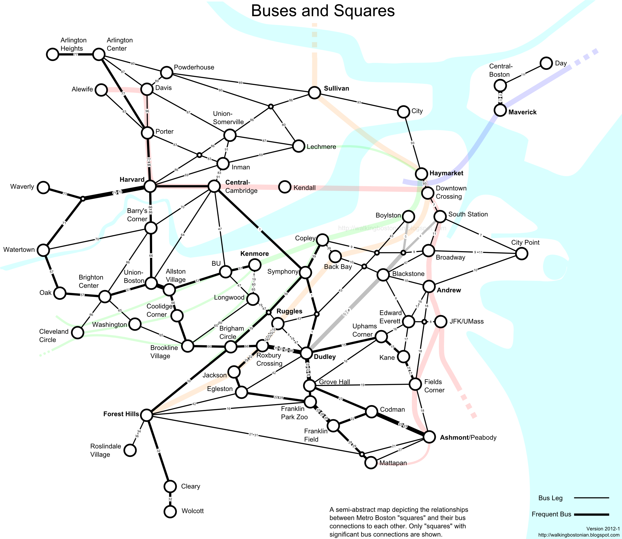
Square hopping by bus

[full-size]
Bostonians love their squares. One of the first things you'll notice is that few, if any, of them are actually "square." Most of them denote some intersection of congested streets and they are mostly covered by asphalt and heavy traffic. Some have lively street life, others might be just a convenience store and a bus stop. Still, they form a collection of loci for navigation around the infamously twisted and confusing streets of Boston. We don't have a grid; instead, we travel square-to-square.

I've been thinking about ways to approach the MBTA bus network from this frame of reference. It's the mental map that I use when choosing a path to travel across the city, or when I want to consider my options given my current location. This map doesn't focus on the particular streets or curves in the geography of the route. Significant locations along the way are connection points to other buses. In Boston, it turns out, most of those can be found in one of the many squares.

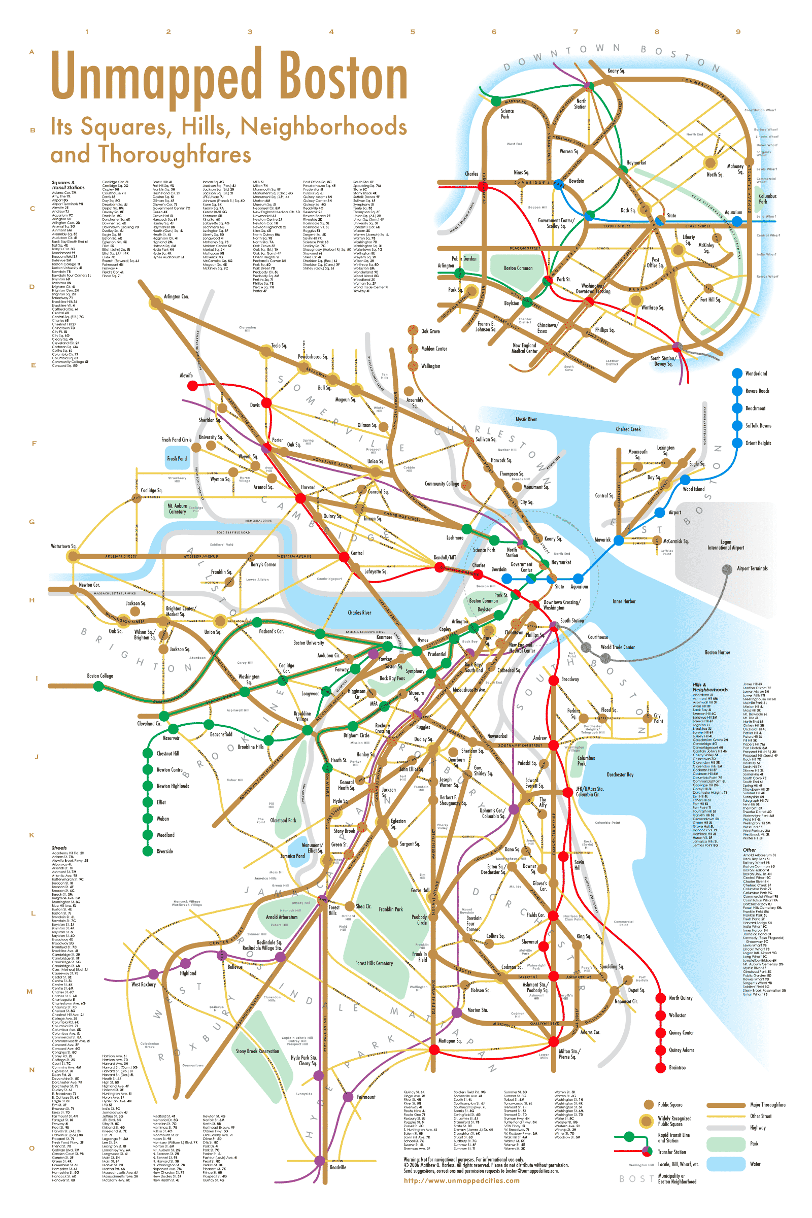
I began drawing this map by placing as many of the squares that I could remember off-hand. This got me maybe 80% of the way. Then I began adding bus routes based on their square-to-square travel patterns. Where they intersected, if I couldn't recall the name of a square there, then I attempted to look it up in the handy Unmapped Boston chart. Then it was a matter of adding context and tweaking the map to make it more informative. Unlike the typical transit map, this map de-emphasizes the rapid transit network and puts bus information foremost. Key bus routes are included, using thick lines, but there are also many less frequent bus routes which are still critical to the overall network. To keep this sane required some tough choices. The map definitely does not reflect the entire bus network -- far from it. Instead, I tried to stick to routes with a reasonable day and night span, and ones that fit into the overall theme of square hopping. The oversimplification of routes also keeps it from being too confusing, I hope, though it is still a fairly busy diagram.

The style imitates a Harry Beck map in some ways. That type of map has long been a great boon for rapid transit travel, and I have been frustrated by the lack of such a map for non-key bus routes. So hopefully this map is useful in that respect. Also, while drawing it, I realized that it looked somewhat like a board game; all you need is a set of rules, some player pieces and a pair of dice.